Überwacht
Cybersecurity dashboard

The project
Überwacht is a cybersecurity start-up from Berlin that offers an API to alert European companies on dangerous data breaches.

Challenge
Define the essential features and create hi-fi prototypes for an early-stage MVP of the client area dashboard.
Goal
To facilitate prompt and efficient responses to cyber security threats.
How we got there
We created our plan on Figjam following these principles:

During this period, we closely collaborated with our stakeholder Dennis, an adept developer skilled in both front-end and back-end development, which he undertook independently.
It was up to us to do user research, site map, user flows, prototypes, and usability tests.
Research

Survey
Fifteen cybersecurity professionals answered our survey, complementing the information we gathered from secondary research and interviews.
Interviews
Due to the tight deadline, it was challenging to find industry professionals available. We worked around it by interviewing students.

Understanding the user

Cybersecurity teams in large European companies face the constant challenge of staying one step ahead of hackers.
To effectively attend user's needs, the product must be
dependable, succinct, time-saving, and trustworthy.
User flow
The main point of contact users will have with the dashboard is right after receiving a threat alert notification.

Guided by our research and user flow, we were able to ideate and craft carefully our early solutions prioritizing what was absolutely necessary for the MVP.
Ideation

Defining Hierarchy
Creating a user-centered hierarchy was one of our main challenges. Through constant testing, we improved the lo-fis several times in order to optimize the dashboard's real state.
Fast Iteration
We "failed fast" by starting out already testing our early sketches and constantly adapting the layout using post-its.
Testing
Goal: Optimize the dashboard’s layout.
And make the most relevant metrics highly visible.
Our Strategy
• Test as early and as frequently as possible.
• Easy to change Figma lo-fi wireframes to try different solutions fast.
• Implement typography and colors only after validating the main structure.
Insights
• Shortening the pages so it takes less scrolling to see everything.
• Using smaller icons.
• Improving the design consistency.
• Changes to copyright.
Client dashboard evolution based on test's insights:

Final Design
Innovative and Trustworthy
We reinforced our design principles with the color palette: neon green for a futurist and energetic feel and dark teal that refers to safety and clarity.


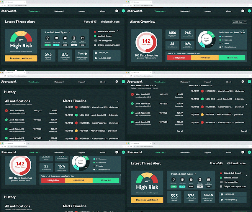
Threat Alert Overview
After clicking on the notification link sent to the user's e-mail, this is what they see:
This screen was the focal point of our project’s design as it plays an essential role at the API's main user flow.


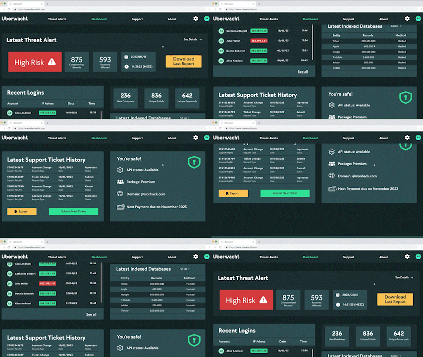
Client Dashboard

The user can find a broader view of their account and the API itself on this screen.

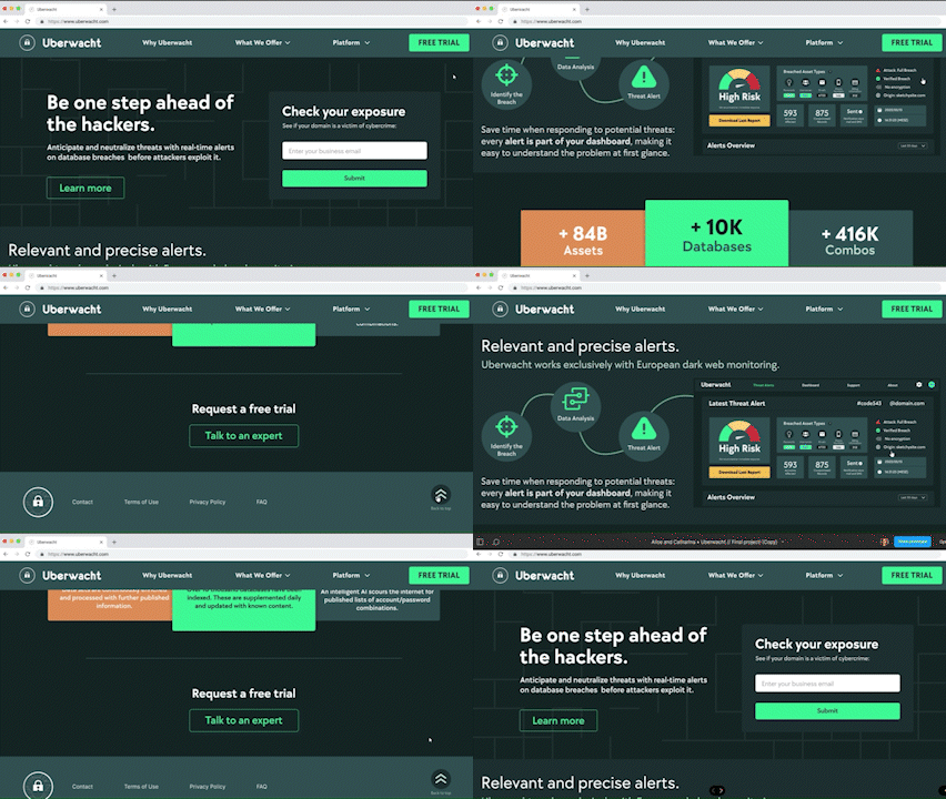
Home
Having a home page with information about the company and their products was important for the Überwacht brand as a whole. So, although it is not part of the main user flow, it adds substantial value to the project.

As it is determined mostly by marketing needs, it's content will change as the product develops.
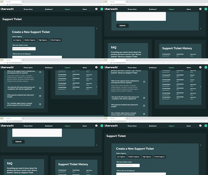
Support
This screen is where the user goes to create a support ticket or check the FAQ.

The minimal design takes away distractions resulting in an intuitive experience.
Test the interactive prototype here.
Next Steps
This is an early-version of the product that still needs a lot of work, such as creating the screens both for the home page and client area.
Threat Intelligence
A panel highlighting patterns amongst hacker attacks in Europe, based on Überwacht’s indexed database breaches, would add value to the product.
Take better, well-informed decisions when planning cybersecurity strategies.
Check out the lo-fi wireframe for this idea:

This was an immensely exciting and rewarding opportunity. Not only we got to juggle technical, business, and user needs, but we also had the honor to create the product from scratch along with the developer who created the API.
Working with UX design and research is never boring as it challenges us
to learn constantly about a multitude of subjects!